
AHRQ Mobile Navigation Update
The Agency for Healthcare Research and Quality’s mobile navigation was outdated, cluttered, and full of accessibility issues. I led a redesign to create a clean, intuitive, and accessible experience that improved usability, spacing, and overall navigation clarity.
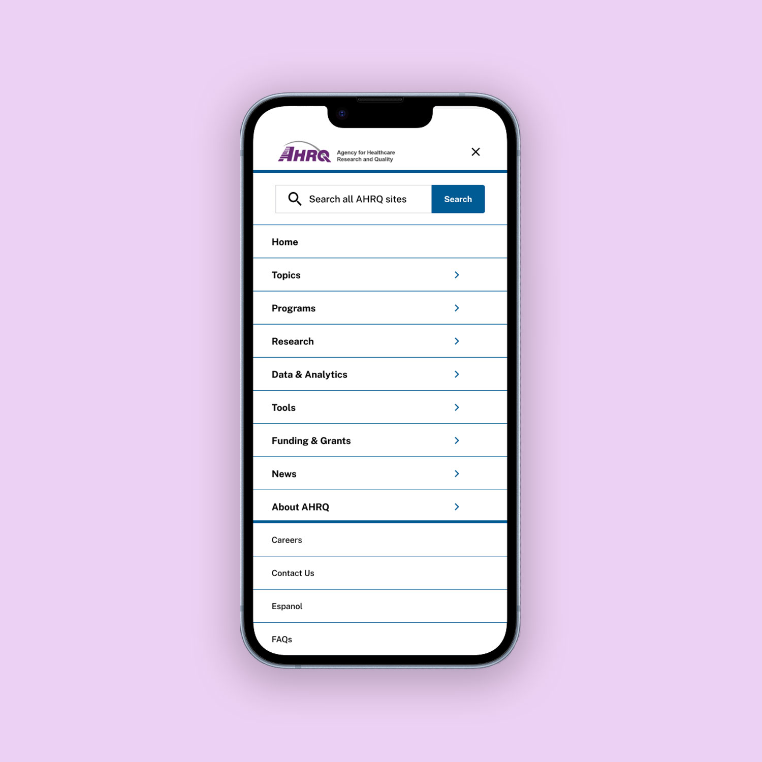

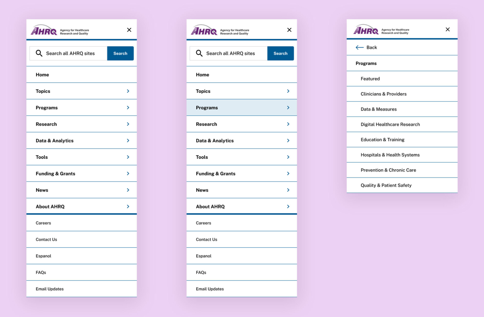
I began the project by identifying key pain points in the existing mobile navigation. The menu was inconsistent, cluttered, and visually confusing. I proposed a full-screen mobile menu for better clarity and focus, updated caret icons for consistency, replaced the outdated close button with a simple "×," and restructured the layout so parent categories open dedicated screens for child items. I also addressed inconsistent hover states, spacing issues, and alignment errors to create a cleaner, more accessible, and cohesive experience.
The redesign focused on creating a more accessible, intuitive, and visually consistent mobile navigation. By simplifying the structure, aligning interaction patterns, and improving visual clarity, I enhanced usability and ensured compliance with accessibility standards.